Overview
Responsibilities
Heuristics evaluation
Stakeholder interviews
- User interviews
- Surveys
- Competitive analysis
- Design system research
- Mood boards
- Sitemaps
- User journeys
- Wireframes
- Visual design
- Prototyping
- ReactJS POC
- Usability Testing
Opportunity
The feedback from our existing and prospective customers was that ELMO’s solutions were outdated compared the modern wave of offerings in the market. Add to that, our developers were struggling to maintain a modern user experience within the current bloated Bootstrap framework.
The goal was to redesign ELMO's suite of HR products by establishing a new modern design system that would help teams build products at scale, providing a modern, consistent, accessible, and delightful user experience for our customers.
Research
We sent system usability scale (SUS) surveys to customers for several of our products and conducted customer and stakeholder interviews to discover common pain points within the product suite.
Information architecture and site maps were studied and documented to understand how we could approach designing a new navigation system that could adapt to any information hierarchy.
We created mood boards, analysed competititors, and researched design systems to establish a design language.
We set out a four key principles.
Make it credible
Be honest and informative
Make it predictable
Maintain an intuitive and consistent experience
Make it inclusive
Accessible for all users from any device
Make it delightful
Easy, simple and pleasant to use
Design
We created a component library within Sketch, designed prototypes, and conducted guerilla tests. To test our concepts usability further, and whether they were techinically feasible, I took the liberty to develop a prototype using React.
Validate
After several usability testing rounds, on mobile, tablet, and desktop, we refined our designs further and our new design system was born, which was simply called ELMO Design System (EDS).

ELMO Design System
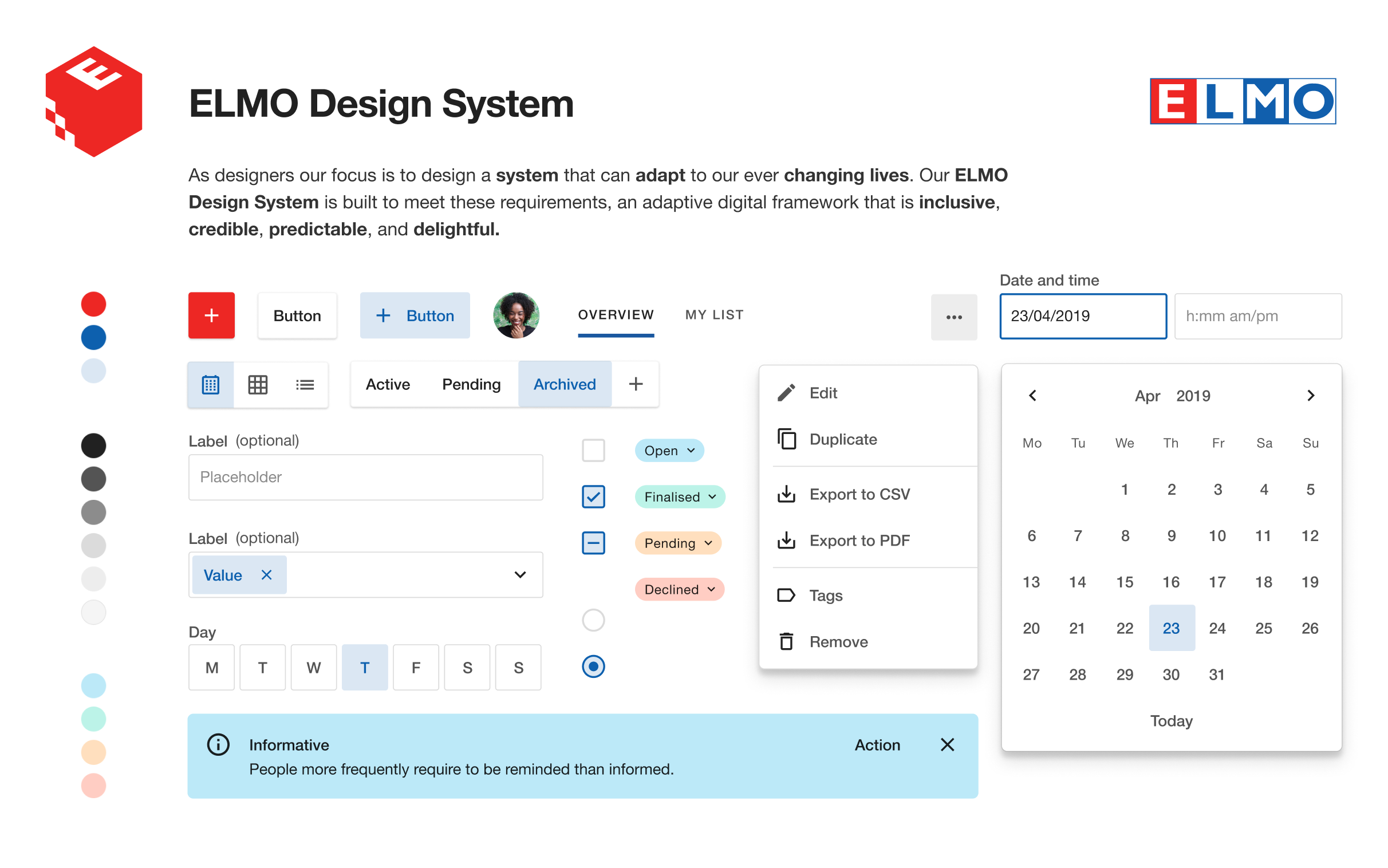
EDS was designed from an atomic approach. Like atoms and molecules, there are components and patterns.
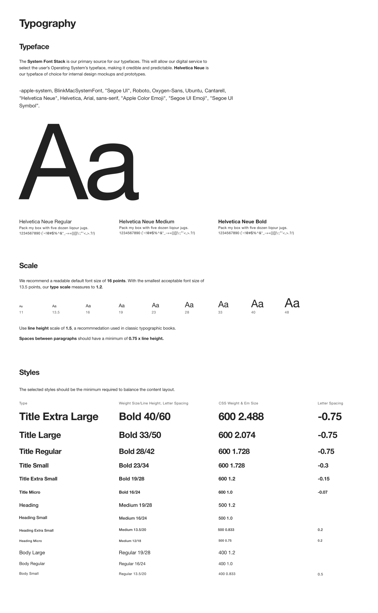
The System Font Stack was chosen as the default font with sizes and colours passing W3C AA/AAA. Iconography was inspired by Material Design.
Colours were specifically selected to assist visual impaired users.
Customer Company Call-to-Action and Interaction

Grayscale

Semantics

Components were designed with touch in mind. W3C accessibility parameters were included for each component.
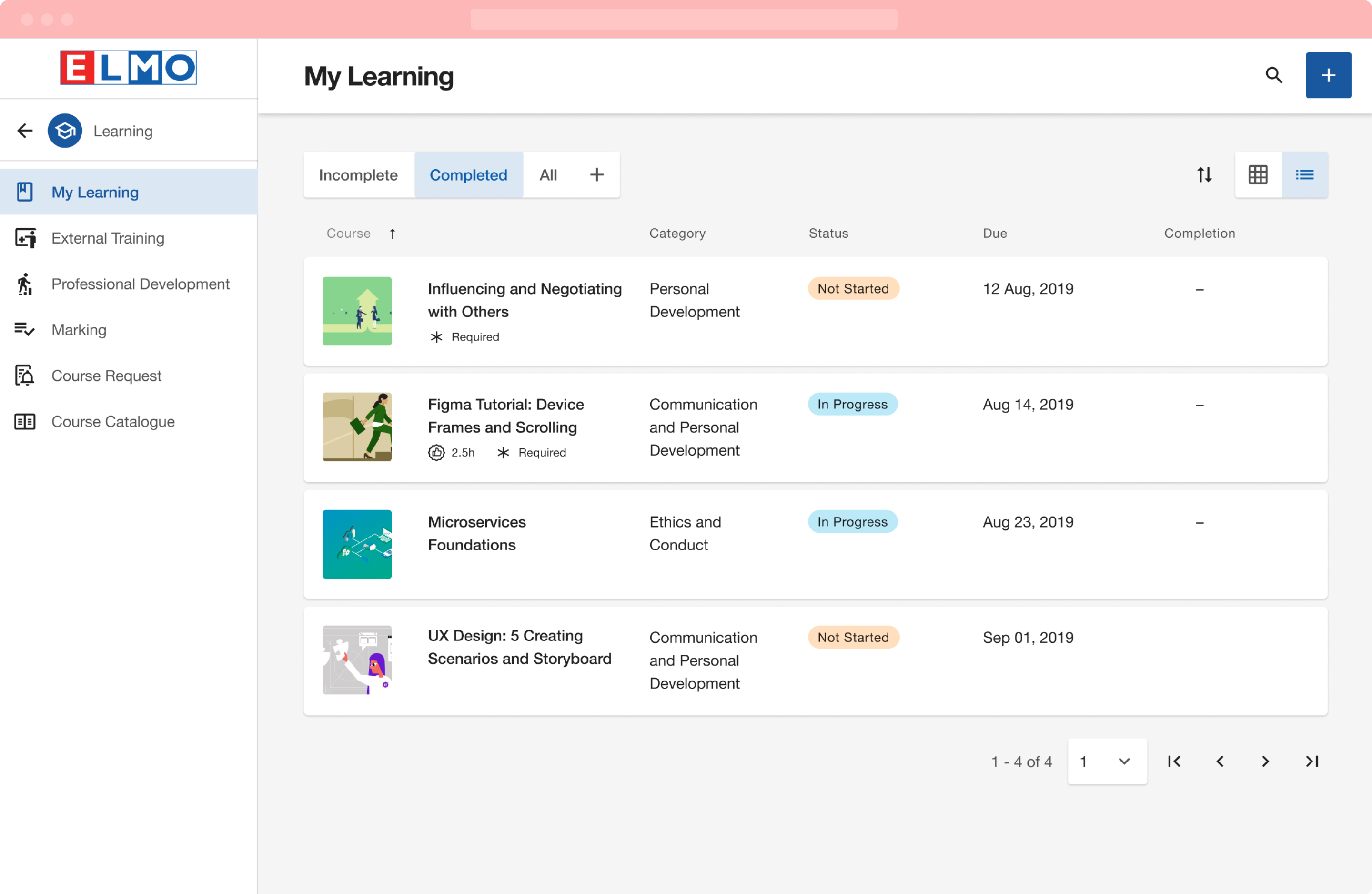
Existing products were revamped with EDS and presented to the organisation and our customers. The response was overwhelming positive. It ignited momentum within the organisation, laying the framework to create awesome and adaptable products at scale into the future.
The true test for EDS occurred when I took on the challenge to rapidly redesign our newly acquired roster, time & attendance product, Boxsuite.
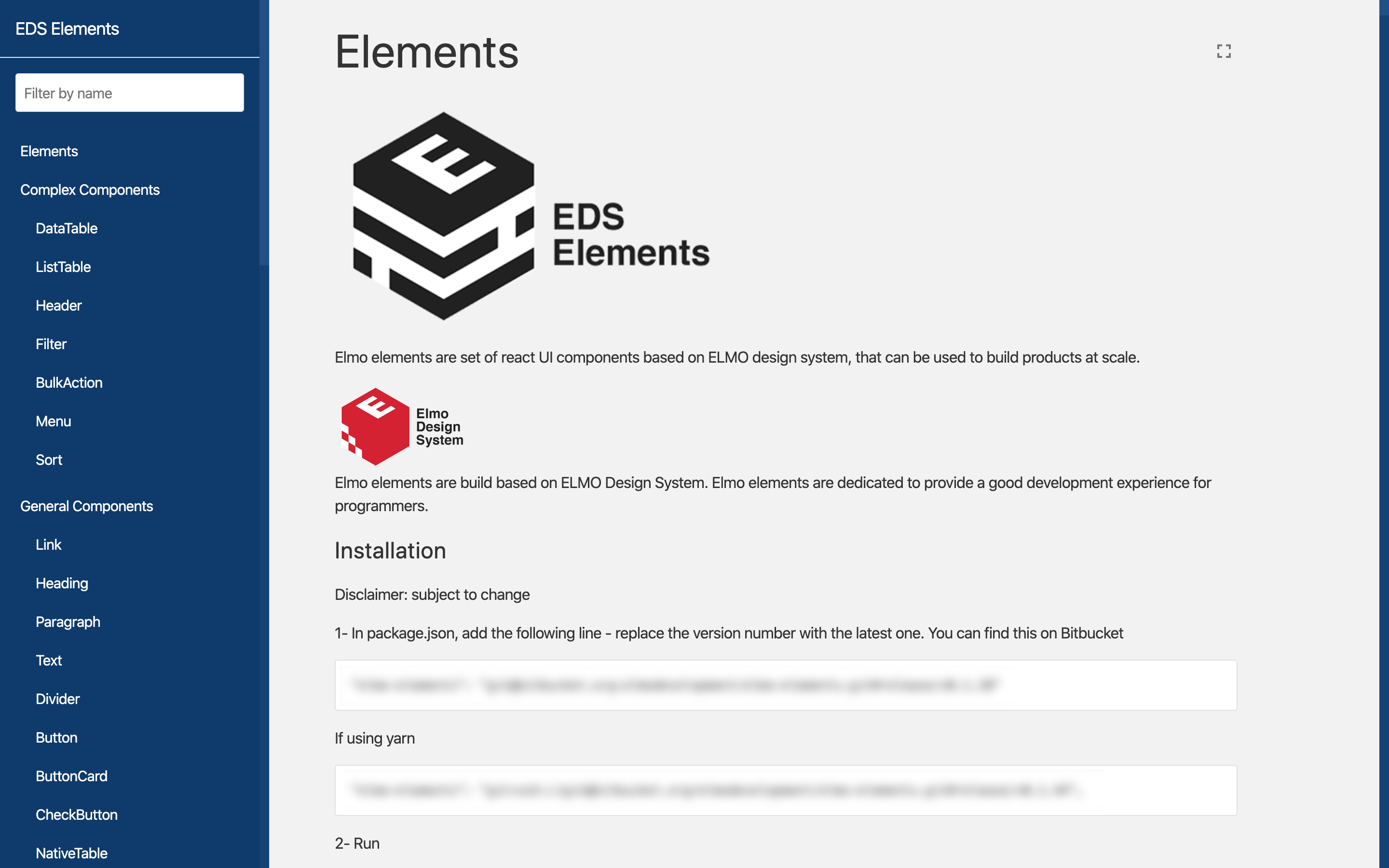
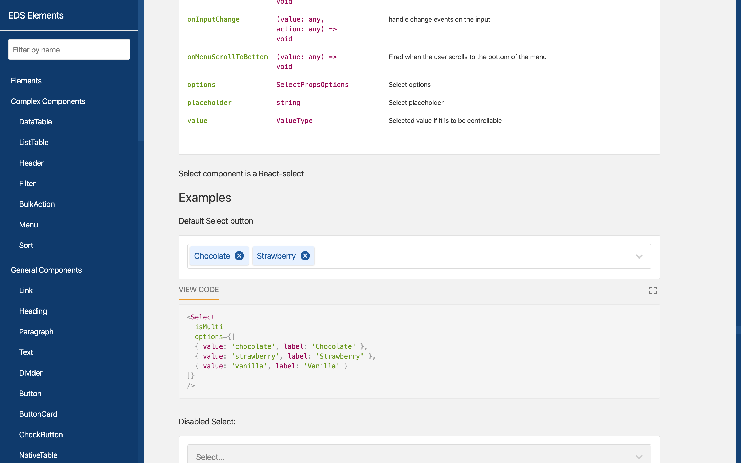
Throughout the journey with our local development team and Herobrands – our BoxSuite development team in the Ukraine – we honed the ELMO Design System React Component Library, Elements, at scale, establishing new processes and guidelines.

EDS was able to adapt to BoxSuite's sitemap and information architecture successfully.
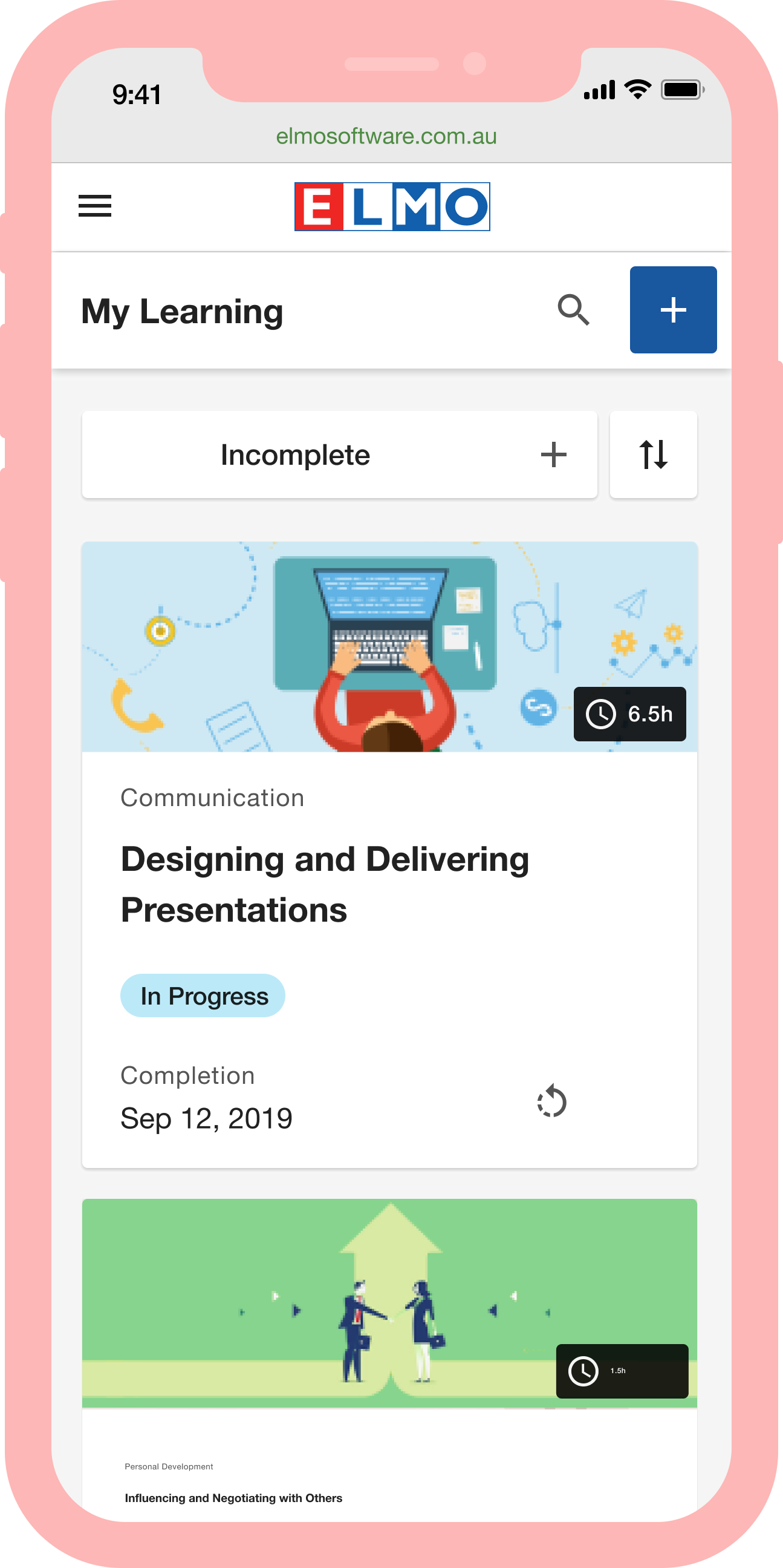
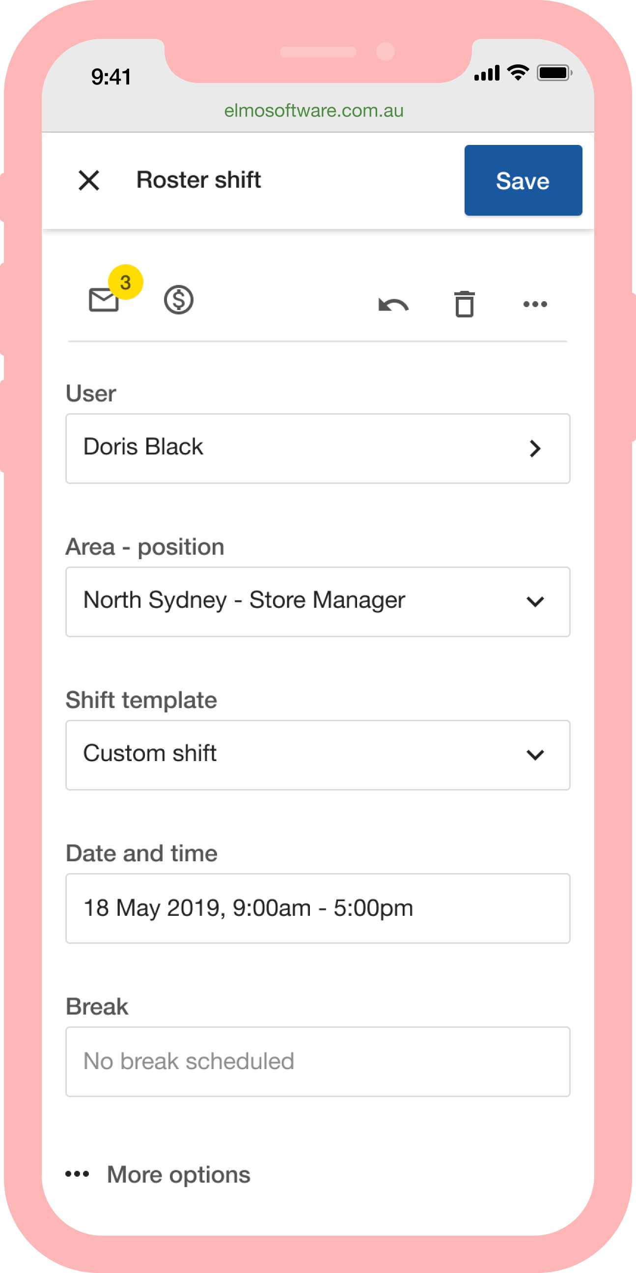
Because EDS's principle of inclusivity the roster system can be used on a mobile device, a rare feat in the roster, time & attendance space.
The Team
Senior UX Designer Verica Nikolic
UI Designer John Rattanachaya
Tech Lead Saman Shafigh
Frontend Web Developer Brandon Choi
Software Engineer Gillian Ng
Software Engineer Raymond Ho
Product Owner Asha Nair
Post Contributions
UI/UX Designer Parimal Chauhan
UX Designer Oscar Marulanda
UX Designer Annette Erickson
Senior Software Engineer Viktor Shlapkin
Software Engineer Joanna Mangahas
Fullstack Developer Frank Liardet
Product Manager Chi Pham
RTA/BoxSuite Engineering Team Herobrands
Special Thanks
CTO Samuel Sun
General Manager - Product Greg Creighton
Senior Product Manager Peter Scott
Product Manager James Macdonald
Other Works
Sage ESS TimesheetsCase Study

ELMO CRTCase Study

ELMO Report SchedulerCase Study
ELMO SurveyCase Study
Sage ESSCase Study
© 2022 GABS

